Web 2.0 Applications Are Invading the Desktop
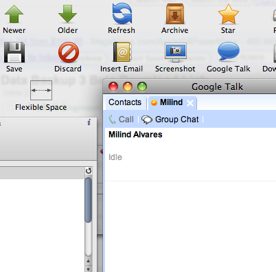
The first Mac application to bring a Web 2.0 application to the desktop was iTunes. The iTunes Music Store can be accessed from within the program’s interface and is deeply integrated with the program itself. Based on this idea, along came another application called Mailplane. It is essentially a web browser, but one that is dedicated solely to running Gmail. It is a unique application that integrates the web interface of Gmail with the various features of desktop email clients and with other programs on the Mac, like iPhoto. The lengthy feature list includes just about every feature imaginable, from drag and drop attachments and Google Talk to iPhoto and Growl integration. Take a look at the screenshot below. If you like what you’re reading (and this blogger highly recommends it), head over to the beta request page to request a fully functional beta of the application.
Mailplane gives you a bucketload of features to interact with Gmail.

After Mailplane and iTunes successfully demonstrated how useful desktop applications dedicated to specific Web 2.0 services can be, along came Mozilla (the makers of the wildly popular Firefox and Camino web browsers) with the idea that anyone should be able to make a dedicated application for any Web 2.0 service they frequently visit. The basic idea is that you enter the URL of the website into a dialog box and the application creates a small application for you that resides on your Mac and can only be used to visit that specific website. It’s like stripping a web browser to the barest minimum requirements, setting a homepage, and eliminating the address bar.
What’s the use, you ask? In my humble and completely unscientific opinion, there are two uses of this arrangement. One is that in case of a browser crash, your web app will not be harmed, ensconced as it will be in its own private little world. The second benefit is that you can set your web app to have a specific window size and keep it in the Dock, so whenever you need to use it, all it takes is one click and it will launch in a window that is the perfect size for it and will instantly be ready for you to work with. No bookmarking hassles. So you can have an application each for Facebook, Google Reader, Flickr, or whatever else strikes your fancy.
Mozilla’s offering is called Prism. It is based on the same Gecko rendering engine that Firefox and Camino use and is a cross platform application. After Mozilla ventured forth into this field, an independent developer, Todd Ditchendorf, decided to make his own little application that has similar functionality but features the WebKit rendering engine instead (the one that is used by Safari) and is more in line with the look of Mac OS X. He christened it Fluid. While the former can run on both Tiger and Leopard, the latter only has love for the Leopard users among us. I suppose the choice between the two basically depends on the browser one prefers. If asked to choose between the two, I would pick Fluid because of the native feel and the more polished overall interface. I would, however, replace the default icon of Fluid with the cool icon that Prism boasts of.
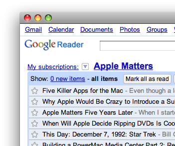
Here’s a screenshot of a Google Reader application made using Fluid:

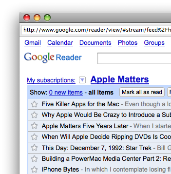
This one is powered by Prism:

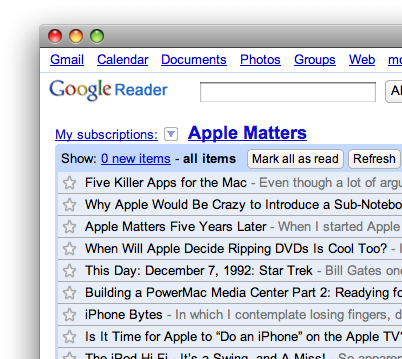
And this is Google Reader in Safari (for the sake of comparison):

Both of these applications are in the beta and pre-beta phases and still have a long way to go, but they are definitely a step in the right direction. If more developers decide to jump into the fray we will probably have very cool dedicated applications for famous services like Flickr, deviantART, Facebook, etc. which redefine the way we interact with these services, just like Mailplane did with Gmail. I think the day isn’t far when we will be browsing the wallpapers on deviantART within a dedicated application which will show us only the images which match the desktop resolution, and downloading one would automatically add it to an album in iPhoto and set it as the desktop background. Here’s hoping that the year 2008 really brings the power of the Internet to the user’s desktop. If not, can we at least have that sub-notebook everyone’s been talking about lately? Please?!


Comments
You have completely overlooked Adobe’s offering called AIR. While it is more developer oriented, it is exactly this same idea. Furthermore, one could argue that this sort of thing has been happening for quite sometime. Many Flash developers (as well as other types of devs) have been building “Web 2.0” Apps for the desktop utilizing tools such as Flash—Screentime and or Zinc.
Fluid and Prism are great offerings (esp. for non-devs), but they are only one side of the spectrum.
All this stuff makes me wonder, will I get some form of steady internet on my mac? Will I be stuck with dialup for the rest of my life? If every man’s one hope is not to die a virgin, mine is that I may for once get some form of steady internet at home.
Great writeup btw, particularly about fluid. I had heard about the app, and then forgotten the name.